Tuesday, June 4, 2013

The Age of Industry and the Arts

My exhibit features works of art that depict and represent industry.  I chose this as a theme because I believe that industry has had a very strong influence and impact over the course of recent history and continues to have a large impact today.  Industry is not something that is generally considered synonymous with beauty so how artist choose to depict industry is very interesting.  It is interesting to see what artists have to say about industry.  One motif that is common in many of the works of art in my exhibit is repetition.  Whether it be multiple smokestacks or multiple pieces of machinery in a factory, repetition is used to explore the extreme levels of production in the age of industry.  The amount of goods we are able to produce these days is astonishing is when put in historical context.  Another theme in these works of art is the interaction between the natural world and the industrial world.  Some of the images show dense factory centers surrounded by hills or trees.  The nature stands in stark contrast to the machinery.  I do not believe that industry is depicted favorably in many of these works.  It is instead depicted as a force of destruction and as monotonous.  For example the piece entitled “Industrial Hall (Phillip Morris)” shows a rather bland, block-shaped factory that has very little that is beautiful about it.  It should also be noted that Phillip Morris is a tobacco company so not only is the building ugly, but its purpose is arguably sinister.

Walker Evans, “[63 Views and Studies of Ohio Clay Plants and Workers, Commissioned by Fortune Magazine For the Article "Clay: The Commonest Industrial Raw Material", Published January 1951]”, 1950, Not on display

Michael Wolf, “Industrial #2”, 2005, Not on display

Frank Breuer, “Industrial Hall (Phillip Morris)”, 2000, Not on display

John Kane, “The Monongahela River Valley, Pennsylvania”, 1931, Gallery 774

Charles Scheeler, “Water”, 1945, Gallery 911

Abe Ajay, “Heavy Industry”, 1935-43, Not on display

Charles Thurston Thompson, “French Machinery”, 1855, Not on display

Umberto Boccioni, “Landscape with Industrial Plants”, 1909, Not on display

Cesar Domela, “[Photomontage: Industrial Pipes and Boilers]”, 1928, Not on display

Designer unknown, “Panasonic Radio (Model R-72S)”, 1969, Not on display

Tuesday, May 28, 2013

LES galleries reaction

The art galleries located in the Lower East Side are quite different from those located in Chelsea.  It is pretty clear that the galleries in Chelsea contain the art of more established artists.  For one thing the spaces are substantially larger in most cases and the environment seems more professional.  Most of the galleries in Chelsea are filled with the art of only one artist.  In contrast, the galleries in the Lower East Side are smaller and have a different vibe.  They seem more underground and the art is certainly more experimental.  The art in Chelsea seemed to me to be more thematic.  For example the art by the Chinese artist which had political themes.  The art in the Lower East Side was different from that.  In the BOSI Contemporary gallery there was an interesting exhibit of art by Tatyana Murray entitled “In The Woods”.  This exhibit did not seem to me to be very thematic.  Rather it seemed to be more sensational and aesthetic. 

Another gallery in the LES was a hybrid gallery/bookstore.  In some cases it was hard to tell where the art stopped and the bookstore began.  Despite this perhaps seeming unprofessional, it lent a certain charm to the space.  The charm of this and other galleries stuck out to me.  Whereas the galleries in Chelsea were clean, ordered, and had shiny floors, the galleries in the Lower East Side seemed more disorganized and dingy which added to their underground vibe.  For example at the Stephan Stoyanov gallery and Untitled gallery the floors where hard wood and appeared to be old and warped.  At the Stephan Stoyanov gallery, the basement was accessible.  This downstairs space epitomized the word dingy.  It had projectors projecting mixed media works of art every which direction and the ceilings where low.  But it added to the feel and gave the gallery a uniqueness that I enjoyed.  The Untitled gallery had a section of the back that was a mix between a storage space for art not on display and pieces that were up for display, along with some folding chairs and other unanimous objects. 


I found the art galleries in the Lower East Side to be more accessible.  This was largely due to the spaces which were maybe less professional but more homely.  I also thought the art in the LES galleries was a little more inventive and maybe didn’t take itself as seriously as the art in Chelsea.  Both of these areas have their positives and negatives and share similarities and differences.  In the end that is maybe why they are able to co-exist in a city that is famous for art.  

Tuesday, May 14, 2013

Public Art Reaction

The public work of art I found in my neighborhood was located in near the entrance of an upscale apartment building.  It is a statue of an upright human figure next to a column.  It is made of flat pieces of stone, possible granite, stacked upon each other.  The slabs of stone are rough and slightly jagged.  The slabs are of slightly different hues of an earthy gray.  This statue looks almost as if it could be from ancient times.  It clearly has classical influences.  The column appears to be influence by Hellenistic culture.  The human figure has their arms crossed almost like an Egyptian mummy would.  There is no doubt that the artist was influenced by some archaic Mediterranean culture.  The statue looks like something that could be found in the ruins on a remote Greek island.  The form of the human figure is rounded and indistinct like a statue that has suffered from hundreds of years of rain and wind erosion; similar to the Egyptian sphinx.  I believe it was the intention of the artist to create a work of art that reflected its ancient influences. 

The statue is in the garden next to the doorway of a luxury apartment building on 96th street between Lexington and 3rd.  Off to the side and behind the statue is a plaza/garden that is very well kept and nice.  The statue seems almost to be a watchman of this quaint garden space.  The statue fits well into its surroundings.  As it stands as a watchman over the garden, it also stands watch over the entrance to the apartment building.  It looks good as part of the garden in which it stands because of the natural look of the statue; its edges are not straight and clean.  They are rough and look as if they were pulled right out of a river. 

I have walked by this statue numerous times but I really noticed it after we vised Moma PS1.  There was a work of art from the same artist which was a part of the same collection of stone figures.  When I used to walk by I didn’t think as much of the statue because, although I liked it, I thought it was maybe some corporate art.  My opinion admittedly changed when I found out that the artist was more renowned in the art world than I would have expected.  I think this piece would have initially turned my head more had I first seen it in a museum or gallery.
Boaz Vaadia
“Yahkin”
Stone sculpture
1993

Tuesday, April 30, 2013

Chelsea Galleries Reaction


When choosing a work of art I would want to collect, I tried to look at it as an investment and something that I would enjoy.  I looked for a work of art that seemed to me like it could be timeless, something that was not too trendy that would retain value.  To do this I tried to figure out the historical identity and the cultural identity of the art and how those respective identities fit into the world moving forward in time.  I believe art that has a high level of historic and cultural value has a better chance of retaining value.  For the art that I would want to collect, I chose works from the exhibit by Charles Freger entitled "Wilder Mann".  This exhibit contains portraits of people dressed in fantastical and primal costume.  They dress up in these costumes for different festivals throughout parts of Europe.  These works of art have a very strong cultural and historical identity.  The have influences from pagan traditions and Christian traditions of the past.  I think these aspects will give Freger’s work more value moving forward into the future.  As the forces of globalization continue to generate a more singular, monotonous culture worldwide, art like this with its historical and culture value will become more valuable; especially if the festivals where these costumes are worn begin to dwindle in number and significance.  I also really like this art.  I love the monstrous, shamanic costumes.  They strike in me fear and curiosity.  

On the other hand, for art which I would not buy as a collector, I chose work from the British artist Richard Hughes.  To me, this art does not have as valuable a historical and cultural perspective.  The cultural perspective of this art is very modern.  The pieces of art are made up of industrial material such as concrete or plastic.  This art seems to almost be factory made.  The historical perspective is very much rooted in the present, which, in my mind, will not add to its value moving forward.  The industrial nature of our global culture is growing, so, while Richard Hughes' art may remain relevant moving forward, I do not see it growing in value as much as the work by Charles Freger.  Another reason that i would not by Hughes' art as a collector is that the work is large and heavy and would be difficult to store and would be expensive.  


Friday, April 19, 2013

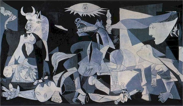
LIB 110 Picasso Imitation Project


For my Picasso imitation, I tried to try to recreate one of his drawings.  This was because I enjoyed the drawings by him done in pencil, and because pencil and paper were what I had at my immediate disposal.  The drawings of his which I enjoyed generally had a central subject like a person or an animal.  I found a lot of his drawings to be simple yet still abstract.  In these drawings, Picasso utilized simple contour lines and limited hatching and shading.  Because of these features, the drawings generally appeared very flat.  My drawing also uses simple contour lines and limited hatching.  I noticed in some of Picasso’s drawings he would establish a focal point by using bolder lines, and hatching and shading in a condensed area and then using thinner lines on the periphery of this area.  I used this technique in my drawing.  The focal point is meant to be the eyes and nose.  That is where I used the boldest lines and where I employed hatching and cross hatching.  The other parts of the subject surrounding the focal point, like the neck and ear, are done with thinner lines.   

Some of Picasso’s drawings seemed to have a sense of incompleteness.  There would be lines that did not connect or anatomical features, such as an eye or nose, which were missing.  It almost seems as though a full and complete drawing of the subject was on the paper in invisible ink and Picasso merely sketched a rough outline over the invisible form which only he could see.  In my drawing, the man only has one ear and I decided to completely omit the mouth. 


Tuesday, April 16, 2013

Illustrate a Story

This story is one of nostalgia for a time when people were more genuinely connected than they are today.  Despite all our technology and social media, in some ways we are less connected than we were in the past.  The narrator of the story laments that lack of the human voice in our society today.  I tend to agree with him.  The human voice is a powerful thing and is truly the best way for us to communicate and make connections with each other.  In my illustration, the human voice is represented by the forms which issue forth from the mouths of the old man and the infant.  These forms combine together to represent the connection that the old man and the baby are making through the human voice. 


http://storycorps.org/listen/studs-terkel/

Tuesday, April 9, 2013

Art and Identity: The Museum of Modern Art

For our second trip to the MoMA, we viewed works of art that had a function other than just being a work of art.  These works of art could serve to entertain the viewer through interaction or serve to display valuable data.  Some of the works of art had higher functionality than others.  

The first design I chose to represent a work of art with high functionality was a architectural drawing by Henri Labrouste titled "Hypothetical restoration project of an ancient city (thought to be Agrigento)".  The drawing depicts a walled city with massive ramparts and multiple turrets.  A city like this is typical of the time period.  In the ancient world, war was very common between rulers so the ruling class often built castles and large fortifications to protect the land to which they lay claim and to deter their enemies from invading.  Large walls like the ones portrayed in Labrouste's drawing served to protect the Ruler's city and subjects and to display the power of the Ruler.  A city like this is not common in our time.  Enclosing walls would prevent a city from expanding and make travel in and out of a city much more inconvenient.  This is because we are fortunate enough to live in a time where we do not have to worry about being invaded by neighboring countries like the people of ancient times did.  Their need for protection is why a city with high walls would be very functional.  

For my second design of high functionality I chose a piece by Massoud Hassani.  The work of art is titled "Mine Kafon Wind-Powered Deminer".  The function of this design is to detonate land mines safely and efficiently so that the mines are not detonated accidentally by an innocent passerby.  Land mines kill numerous innocents every year.  There are other ways to clear land mines but what gives Hassani's design a very high functionality is how efficient it is.  Other mine clearing methods are often very expensive or time consuming.  Hassani's design is powered by the wind and is low-cost.  The wind pushes it across mine fields and once it has detonated a mine it can be reassembled for further use.  The design is extremely efficient and serves the important function of saving the lives of innocent people.  

To illustrate low functionality in design, I chose a piece of art by Didier Faustino entitled "Stairway to Heaven".  This work of art is a stand-alone, three story, concrete staircase that appears to be ripped out of an apartment building. At the top of the staircase is a caged basketball court for one.  This is a design of low functionality because the basketball court does not need to be there.  The artist is trying to say something about solitary play with the placement of the court but in terms of acting as a fully functional basketball court it comes up very short.  If one is looking for a good place to play a pick-up game, a normal, ground level basketball court would be much better.
The second design of low functionality I chose is titled "Babel Blocks" and is by Constantin Boym and Laurene Leon Boym.  The work of art is several figurines of people.  Each person represents a different culture or religious denomination and they appear very different visually, however all the figurines are the same size and shape.  The similarity in size and shape is meant to represent the a message of understanding and tolerance.  That is the function of this work of art; to represent an idea.  It does a good gob of doing this but the reason I designated this work of art as something of low functionality is because the function of delivering a belief or idea is not as practical as other functions.  Hassani's work of art detonates land mines and that seems to me to be of a higher functionality than just provoking a thought.

All of these works of art have a function that is useful.  What separates the designs of high functionality from the designs of low functionality is the real life application of their functions.  The designs I chose to represent high functionality are able to complete a real life task, whether it be preventing unnecessary deaths from land mines or keeping out hostile invaders.  The others designs I chose are more used to serve the function of representing an idea.  They do a good job of this but compared to the designs of high functionality, they seem  more to be merely works of art rather than highly functional designs.  

Henri Labrouste
"Hypothetical restoration project of an ancient city (thought to be Agrigento)"
Pen, graphite, and watercolor on paper
1826-31

Massoud Hassani
"Mind Kafon Wind-Powered Deminer"
Bamboo and biodegradable plastics
2011

Didier Faustino
"Stairway to Heaven"
Photograph
Model: extruded PVC, plaster, and paint
2002

Constantin Boym and Laurene Leon Boym
"Babel Blocks"
Wood
2007-12

Tuesday, April 2, 2013

Art and Identity: The Museum of Modern Art

In all art the artist strives to make a connection with the viewer by communicating an idea, an emotion, or an experience through their work of Art.  What an artist is trying to communicate to the viewer can generally be identified into three categories; individual identity, cultural identity, and historical identity.  I chose three works of art from the MoMA that each represent one of these identities.

The work of art I chose to represent the identity of an individual was a piece by the renowned Frida Kahlo.  It is a self-portrait of Frida with one of her pet monkeys.  Frida paints a very personal and honest depiction of herself.  She includes her uni-brow and the relatively unattractive facial hair on her upper lip, which, although not making her appear beautiful,  shows that she is being completely honest with herself and the viewer.  This in turn reveals more about Frida Kahlo's individual self than an embellished or altered self-portrait would.  From the description on the wall I found out that she and her husband, Diego Rivera, adopted monkeys to make up for the fact that they were unable to conceive children.  This adds even more of an individual identity to the piece.  Although I'm sure Frida cared very much about her primate pets, the impossibility of becoming a parent must have been extremely sad for Frida and the viewer can see this through the painting.  This is a work of art that must speak to many people on a very personal level.

I chose a work of art by Rosemarie Trockel to represent cultural identity.  It is a work of art made of wool with the words WEST GERMANY stitched repetitively across the whole piece.  The plaque next to the piece claims that this stitching is, "An allusion to the artist's background and to the commodification of artists and art in a capitalist society".  Trockel wants to say something with this piece about living in a capitalist culture.  It is especially interesting when one regards the situation in central Europe at this time in history.  Germany was split into the capitalist state West Germany and the communist state East Germany.  It is one of the most significant examples in history of where the two radically different ideologies of Capitalism and Communism came into conflict with each other.  Rosemarie Trockel also seeks to express her feelings of the female's place in a male-dominated culture.  The plaque on the wall describes how she expresses this.  It states, "By using traditionally feminine resources and techniques, she calls into question an assumed hierarchy of materials, which places painting at the top and craft at the bottom".  It can be said that this work of art actual contains cultural identity and historical identity.

To represent the historical identity, i chose a painting by Frantisek Kupka.  This work of art has a historical identity to it because it is one of the first fully abstract paintings in modern art.  It is more concerned with Art History than with world history.  This painting must of been very unique at the time it was painted and I am sure it has influence many artists throughout the years.  What i found interesting about this painting was the flatness of it.  at first i couldn't tell which of the different shades of blue were the foreground and which ones were the background but then I realized that this painting was not meant to have a foreground or a background.

Learning about the different types of identity in art has been very interesting for me.  It has helped me to see art in a new light and to organize my ideas about a particular work of art.  I feel that i can now now see deeper into a work of art and understand what the artist is trying to communicate to the viewer that much easier.

Tuesday, March 19, 2013

Narrative Digital Collage


This Collage is about how I became a massive fan of the English Premier League football club Tottenham Hotspur.  It all started in the summer of 2008 when I went on a school trip to Italy and Greece.  At the time, like most Americans, I regarded the sport of soccer with contempt and considered those who played soccer to be "foot fairys".  But that changed when I was in Europe.  The Prestigious Euro 2008 tournament was going on and from watching it I grew to admire the sport and the passion of the european fans, thus my inclusion of the Roman Coliseum and the logo of the Euro 2008 tournament in the bottom right.  Once I arrived home from europe I decided I wanted to find a european club to to follow.  I choose Tottenham particularly because of my partial English heritage and my dream of one day traveling to see London.  Tottenham Hotspur Football Club are located in North London where their historic stadium, White Hart Lane, is located (the background of my collage).  I included Big Ben to represent my desire of traveling to London.  I included three of my favorite Tottenham players, Clint Dempsey, Rafael Van Der Vaart, and Gareth Bale.  Gareth Bale is far and away my favorite player.  I really enjoy watching him play.

Tuesday, March 12, 2013

I believe that good Art expresses an idea or value that is worth expressing.  The idea or value does not have to be obviously apparent and it's alright if the audience has difficulty figuring it out.  I also believe that good Art has to be aesthetically pleasing, even if it isn't beautiful by traditional standards.  Another qualification of good Art is it should be creative and unique.  Any and all forms of Art have influences and are imitating something but being able to create a piece of Art that has either never been done before or is a new and unique spin on something older is important.  I also think good Art should require some sort of technical skill such as an adept painters stroke or exceptional proficiency with a musical instrument.  But I think the need of technical skill can be alleviated if the piece of Art is particularly creative and unique


Art can be considered bad if it represents a superficial theme or idea that is not worth expressing.  That of course is entirely sujective to my opinion but that is what I believe.  Because I am not very fond of consumerism and materialism, there are very view visual advertisements such as corporate logos, that I personally will appreciate.  I simply think the motives behind this kind of Art are not good, especially when compared to what I consider good Art.  I also think Art is bad if it has no sort of theme or meaning behind it and is also not technically skillful or creative.  Art can be especially bad if it is those things plus it has no focus and looks like it was just thrown together hodge-podge. 


Maybe this isn't great example because its probably really funny in the context in which they used it on the show 30 Rock.  But without that context this Bigfoot-Mermaid-Rainbow painting is pretty awful.